I like to think of movie posters as the windows to a film’s soul.
A well-designed poster should be a glimpse, a suggestion of what might await you, and nothing more.
Truly good posters of course, like masterful trailers, don’t lay it all out on the artistic table remembering that the whole point of these static displays is enticing you to immerse into someone else’s narrative, their life, their imagination.
Spill the beans too early and the suspense is ruined.
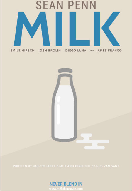
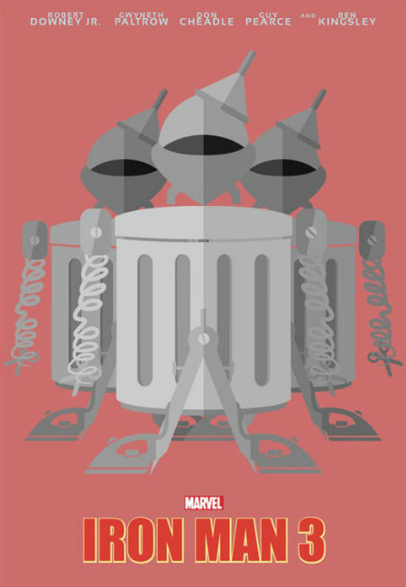
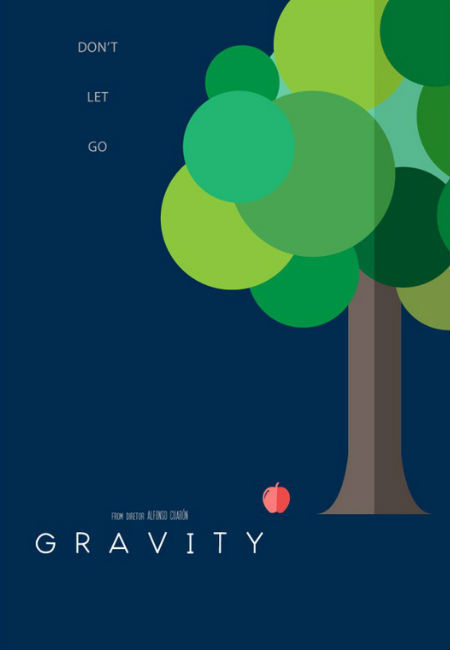
But what if taking things literally was the whole point?
What is that’s what movie posters were supposed to be about?
It’s something that obviously intrigued the mind of Indian illustrator, designer and yes, experimenter Danish Ahmed who took the titles of a slew of great movies and imagined what the posters would like if you took the titles at complete face value. (source: Mashable)
The results are a colourful creative delight, a re-imagining of movie posters that turns conventional wisdom on its head in an endlessly delightful way.
And yes, I would go and see a movie about spilt milk … just don’t cry during it OK?
* You can see more of this talented designer’s work at his tumblr site.